September 2026
See your building's year ahead at a glance
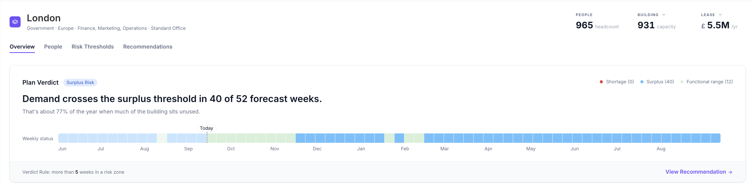
The new Plan Verdict card gives you an instant snapshot of each building's yearly outlook. At the top of the Overview tab, it tells you whether a building is at Shortage Risk, at Surplus Risk, or Within Range over the next 12 months, along with the number of weeks behind that call.
You set the risk tolerance, so the verdict reflects your unique considerations. And what's more, the verdict doesn't just stop there. Selecting "View Recommendation" shows you what you can do about it.
From a verdict to a move you can model
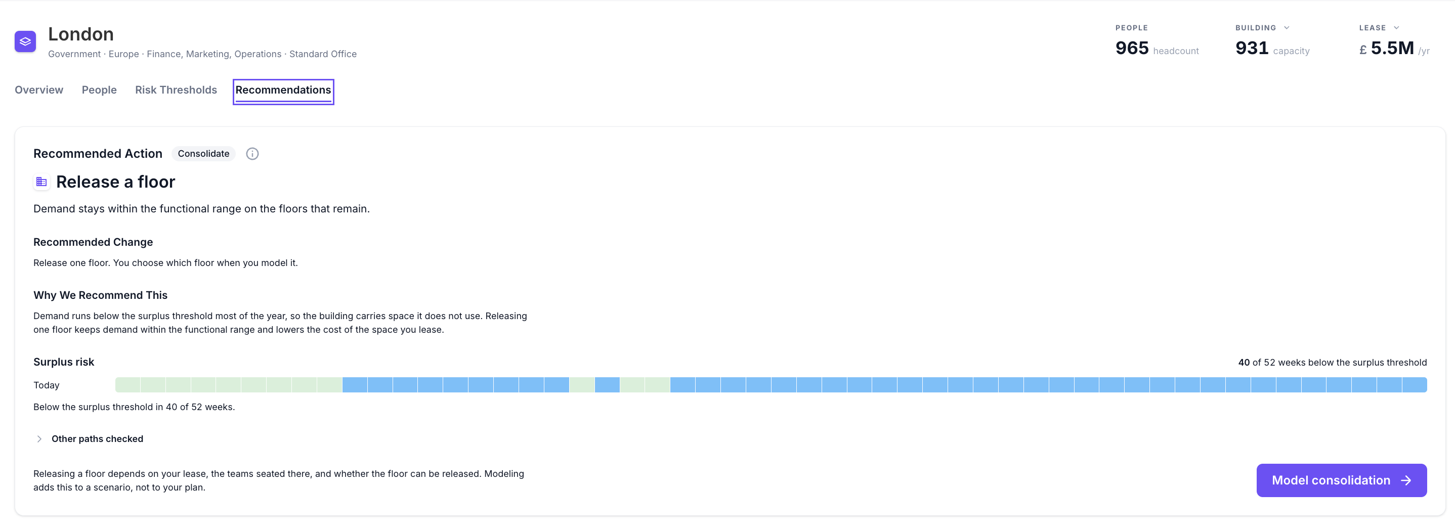
The new Recommendations tab turns each verdict into one concrete action for you to take. If a building is heading for a shortage while another space type sits unused, it suggests converting that space to the type you need. If you're carrying a surplus, it suggests which floor to release.
Every recommendation also comes with an explanation. For example: "Your peak shortage is Enclosed Collab space, while Open Collab space sits unused. Converting the spare Open Collab into Enclosed Collab closes the gap." Meridian then re-runs the forecast with the new capacity, so you can see shortage risk before and after the change, before you commit.
Bring all your sensor data into the Meridian Platform
You may already have occupancy sensors from XY Sense, Density, Butlr, or PointGrab, plus badge, Wi-Fi, booking, and videoconferencing data filling in the picture. Each source tells part of the story, but they don't connect, and replacing them is expensive and slow.
That's why we're excited to announce that VergeSense now brings in third-party sensor data alongside the badge, Wi-Fi, booking, and videoconferencing data we already support. You keep the hardware you've already paid for and make better space planning decisions across your whole portfolio, no matter which vendor measured it.
Reports dashboards now have a Share button in the top right. Select it, copy the link, and anyone you send it to can open a static snapshot of that dashboard load, with the charts still interactive. The snapshot is fixed to the filters and date range you had applied when you shared it, so it does not refresh as new data comes in. Share it with care: the link is publicly accessible to anyone who has it, so treat it the way you would any other exported view of your space data.
Whether your team can create these links is controlled by your organization's Shared Link Policy,
August 2026
Your building is made up of teams, each with its own size, schedule, and rhythm. Now you can plan around them.
The new People tab lets you define the teams inside a building and give each one its own demand. You get a more detailed, accurate forecast and a clearer view of how your space gets used, so you can plan with more confidence.
What team planning lets you do:
- See the real demand behind every team. Give each team its own headcount, attendance, adherence, and arrival and dwell time. Meridian builds a daily demand profile and average weekly peak for each one, then rolls them into a single all-teams view.
- Plan with more accuracy and confidence. A forecast built from how your teams actually show up reflects the way your workplace really works, so the decisions you make about your space hold up.
- Sharpen it further with your own badge data (optional). Upload badge data with a team identifier to make a team's forecast even more precise.
One important note: your existing plans keep working. All your building's headcount starts as a single team, which you can split into your real teams whenever you're ready.
You are never going to measure every square foot of your portfolio. So decisions about Building A gets made on gut feel and rough proxies, even though Building B right down the road is measured, and the people in it work similarly to those you're planning for.
So what if you could take everything you already know about how your people use space in Building B, and use it to plan Building A?
That's why VergeSense created Portable Profiles.
We take how your people actually use your space in a measured building and turn it into a profile you can carry into a plan for another building. Now that office you never measured is planned around how your own people really behave. You right-size it, reconfigure it, or plan its capacity with a forecast grounded in your company and context.
With Portable Profiles, you finally get the full value of the measurement you already paid for. One measured building stops being a single data point and starts sharpening decisions across your entire portfolio. You get to plan confidently everywhere, without having to wire up everything to get there.
Read the full portable profiles announcement
Plan Verdict Card
Plan Verdict card
The Plan Verdict card sits at the top of a Space Planning plan, as well as on scenario and comparison views. It reads the building's one-year demand forecast and answers: over the year ahead, is this building heading for a space shortage, carrying a surplus, or staying within its functional range? The card shows one of three states.
Shortage Risk (red) means forecast demand crosses the Supply Shortage Threshold, the attendance level where about 5% of people present would be left without a seat, in enough weeks to define the year.
Surplus Risk (blue) means demand falls below the Supply Surplus Threshold in enough weeks.
Within Range (green) means demand stays between the two thresholds for all or most weeks. The headline restates the verdict with a week count, for example "Demand crosses the shortage threshold in 12 of 52 forecast weeks," and translates that into plain language. If both risks occur, the one with more weeks becomes the headline verdict and the other is called out as a secondary risk.
Below the headline, the weekly status strip shows one square per forecast week, colored by that week's outcome, with a dashed Today marker separating past weeks from the forecast ahead. Hover a week to see its date, forecast peak demand, and outcome, and to highlight the same week on the supply/demand chart below. The legend counts the weeks in each state, and the footnote shows the Verdict Rule, "more than N weeks in a risk zone," where N comes from your risk tolerance setting. Select View Recommendation to jump to the plan's Recommendations tab.
New Recommendations tab
The Recommendations tab turns a plan's demand forecast into one concrete action you can model. It shows exactly one recommendation at a time, chosen from the building-wide forecast verdict for the plan's base scenario.
Space Mix Change appears when the forecast crosses the shortage threshold and peak demand for one space type outruns supply while another type sits unused, and it suggests converting the surplus spaces into the type that is short, sized to the footprint they free up.
Reduce Footprint (Consolidate) appears when the forecast stays below the surplus threshold in enough weeks and a floor can be released, and it suggests removing that floor.
Monitor appears when nothing crosses an action threshold or the plan does not have enough data yet, and the tab keeps watching in case the forecast shifts.
Each recommendation shows the reasoning behind it. For example: "Your peak shortage is people who can't get Enclosed Collab space, while Open Collab space sits unused. Converting the spare Open Collab into Enclosed Collab seats them." For a Space Mix Change, VergeSense simulates each contributing pool to find the conversion that seats the most additional people at peak, holds demand fixed so added space never inflates demand for that type, and re-runs the 52-week forecast against the new capacity to show a before and after shortage-risk preview.
July 2026
Two New Event Types for Predictive Planning
You can now fold a change you know is coming directly into your forecast, using two new event types: Space Mix Change and Temporary Demand Level. Model a redesign or a temporary surge in people and see what it does before you commit budget or space to it.
What's New
- Model a redesign within your current footprint. Space Mix Change lets you adjust the mix of space types in a building and watch how it moves your peak demand forecast, so you can see whether a reconfigured floor holds up before you sign off on the build.
- Add a known demand event to the timeline. Temporary Demand Level lets you place a time-bound spike (a two-week offsite, a hiring wave, a seasonal surge) with a start and end date, and see whether the building can absorb it.
- See the impact before you commit. Both play out in your forecast up front, so a floor reconfiguration or a demand surge becomes something you plan for, not something you react to.
Lease Cost Context for Predictive Planning
You can now bring your building's lease costs into Predictive Planning. Add your cost data once in Settings and it shows up live in your plan, laying the foundation for cost-aware planning.
What's New
- Add your lease cost data. Capture annual lease cost, operating expenses (OPEX), lease length and expiration, and currency, all configured in Settings → Building Settings. Changes go live immediately, with no plan reset required.
- See it in the new Context Strip. Your cost data now surfaces alongside space and people right on the plan, so every forecast carries real financial context.
- Built for what's next. This lays the foundation for cost metrics like cost per seat, per square foot, and per attended seat, with cost-aware recommendations to follow, so setting up your data now means you're ready the moment they land.
Occupancy Intelligence: New native Space Type and Space Group dashboards
The Space Type and Space Group dashboards have been rebuilt as native, in-platform views, following the earlier move for Building and Floor dashboards. This is part of our shift toward cleaner, built-in charts and tables.
June 2026
Predictive Planning: Bring Your Badge Data
Many of the teams we work with already collecting badge data. Now it has a home. You can upload your own badge data directly into Predictive Planning, giving the Large Spatial Model another real datapoint to sharpen demand predictions specifically for your buildings.
It’s a simple upload: no integration, no FTP, no API keys. Just bring the badge data you already have, anonymized, in whatever format you use today.
What’s new
- Upload your hourly badge data and the model reads your swipe data directly
- We translate raw swipes into true peak occupancy. Badge-ins overcount what’s really happening (people badge in but not out), so the model uses our sensor-trained dataset to estimate how many people were actually in your building at once.
- Find it all in the refreshed Prediction Model tab at the top of Predictive Planning, alongside Workplace Factors, Capacity Pooling, and Desk Policy.
What this means for you
Whether you’re starting with nothing, bringing badge data, or running full sensor coverage, Predictive Planning meets you where you are, turning how your people actually show up into sharper, building-specific forecasts. And because badge data captures real adherence to your policy, your what-ifs (a headcount bump, shifting from 3 days to 2 or 4) reflect what would truly happen, not just what’s on paper.
Occupancy Intelligence: Read-only calendar integrations for Google Calendar and Microsoft 365
Booking analytics just got easier to turn on. You can now connect Google Calendar or Microsoft 365 with read-only access to our space booking automation feature.That means the full booking analytics experience (no-show detection, ROI dashboards, and ghosted-booking insights) without the heavier security review.
What this means for you
This is the fastest, lowest-friction way to put your calendar data to work, surfacing where rooms are booked but never used, and where space is being quietly wasted. It’s a natural way to get more value from the tools your teams already live in every day, with a clear path to richer automation when you’re ready.

Better Together: VergeSense + Logitech
VergeSense recently joined the Logitech Collaboration Program (LCP). Person count data from Logitech workspace solutions like Rally Bar and Spot now flows directly into VergeSense, giving joint customers a richer, more complete view of how every space is used, from data you may already have deployed across your offices.
Because it feeds both sides of the platform, the integration works along the same two lines as the rest of this update:
- Predictive Planning: that same signal strengthens demand forecasts and what-if scenarios; more real-world coverage means more confident decisions.
- Occupancy Intelligence: Logitech person count refines space utilization insights, so you can see how conference rooms and the broader workplace are actually being used.
For enterprises with Logitech solutions deployed, it’s the fastest path to richer Predictive Planning coverage and a more complete picture of occupancy across the portfolio.
Occupancy Intelligence: Average Daily Peak, now across the platform
Average Daily Peak now appears throughout the platform, with a new peak-focused summary card replacing the older gauge cards on Portfolio, Building, Floor, Space, Neighborhood, Space Group, and Space Type views. The Person Count Overview also adds a new "Avg Peak" option alongside Avg and Peak, with a dashed average-peak line on the by-hour and by-day charts.
What this means for you
Average and all-time peak each tell only part of the story. Average Daily Peak shows how busy a space typically gets at its busiest point on a normal day, which is usually the number you actually want when you're deciding how many seats or how much space you really need.
May 2026

Introducing Workplace Factors
We're launching Workplace Factors, a new capability that lets Predictive Planning customers without sensor coverage configure the tool to their specific environment. Tell us about your industry, your location, and your building type, and watch the model's space mix recommendations adapt in real time.
When you configure your Workplace Factors, you're shaping how the Large Spatial Model generates supply recommendations for your space. We know from nearly a decade of data that a building in London operates differently than a building in New York. A tech company typically needs more focused desk stations; a professional services firm needs more meeting spaces. There's no one-size-fits-all space mix for a floor plan, and now, there doesn't have to be.
Workplace Factors takes your industry, geography, and facility type into account so the recommendations you see are specific to organizations like yours and grounded in the data that's most relevant to your environment.
By configuring your Workplace Factors, you're telling the model what's relevant to you and filtering out what isn't. If you're a tech company in London, your recommendations are shaped by data from similar environments.
This matters because Workplace Factors address something we think is the most important barrier to adoption for any AI-powered planning tool: trust. When your organization is making decisions about where people sit, which floors to keep, or how to redesign a space, you need to trust the data behind those decisions. Workplace Factors closes the gap between "this is a smart model" and "this is a smart model that understands my business." It's how we go from one-size-fits-all to built-for-you.
Predictive Planning, with or without your data
Alongside Workplace Factors, we're launching two capabilities in the coming weeks that make Predictive Planning more accessible regardless of what data you bring to the table.
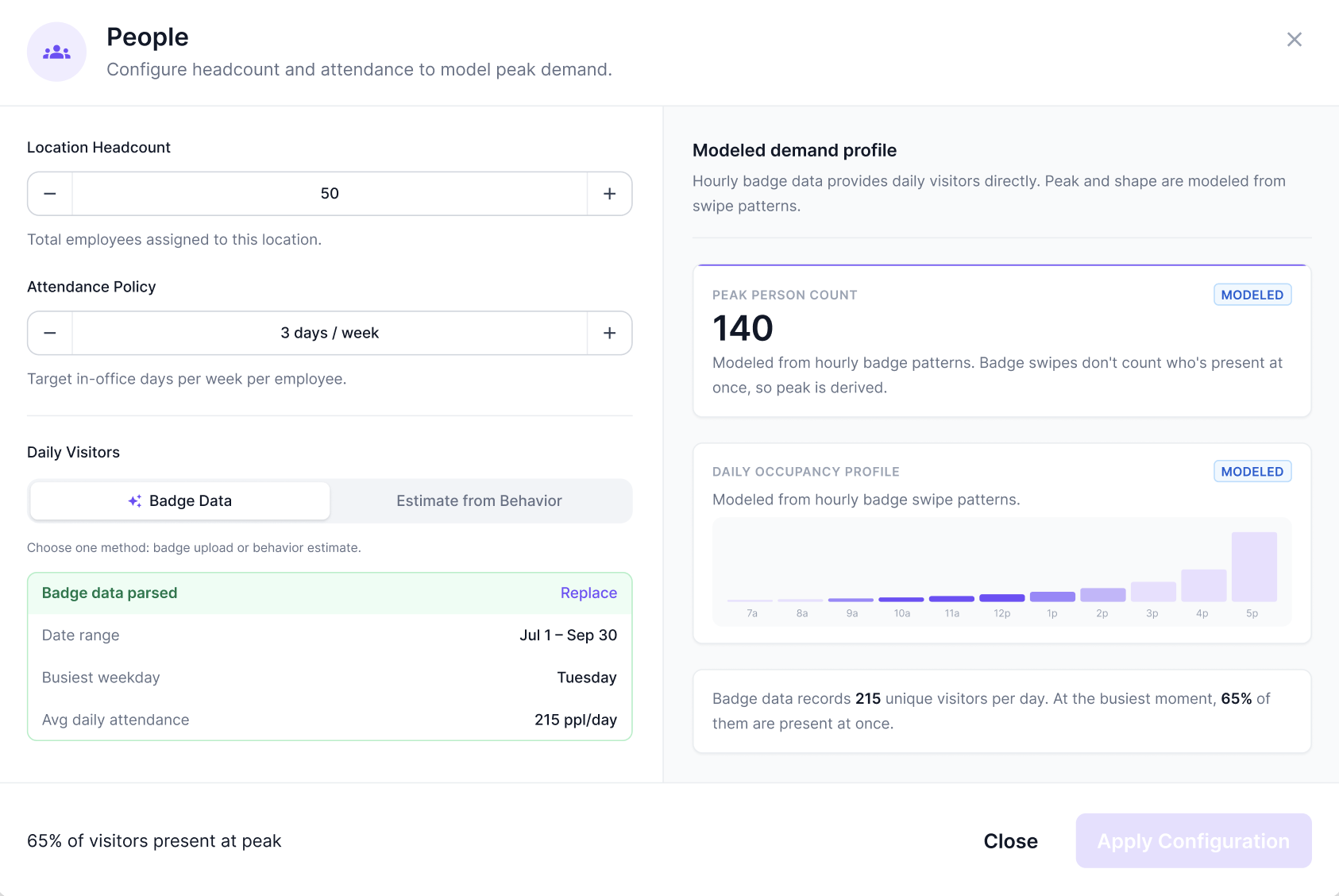
- Self-service badge upload. Many of the teams we work with collect badge data. Soon, you'll be able to upload your own hourly badge data directly into Predictive Planning. Your badge data sharpens demand predictions specifically for your buildings, giving the model more of your reality to work with and giving you more confidence in the output.
- Zero-state demand forecasting. Previously, customers without badge or sensor data received a flat demand line, a static placeholder that didn't reflect real-world patterns.
That's about to change. In the coming weeks, the Large Spatial Model will generate intelligent demand forecasts for your space even when you have no historical data. The predictions will be shaped by what the model knows about buildings like yours, your industry, your geography, and your context, so you get a meaningful starting point from day one, not a blank slate.
.png?width=2880&height=1626&name=Untitled%20design%20(2).png) |
 |
Other Predictive Planning Updates:
- Name your scenario events: You can now give custom names to individual events within a scenario - headcount changes, demand policy adjustments, and pool modifications. Instead of "Event 1" or a generic timestamp, events can be labeled with meaningful context like "NYC RTO increase" or "Q3 headcount reduction." This makes scenarios far easier to read, share, and talk through with customers during planning conversations.
- Compare scenarios directly against each other: Previously, scenario comparison was always relative to the baseline. Now you can compare any two scenarios head-to-head, useful when a customer is weighing two different futures (e.g., "what if we reduce headcount 10% vs. 20%?") without needing to mentally translate both back to a common baseline. This unlocks more nuanced "what if" conversations.
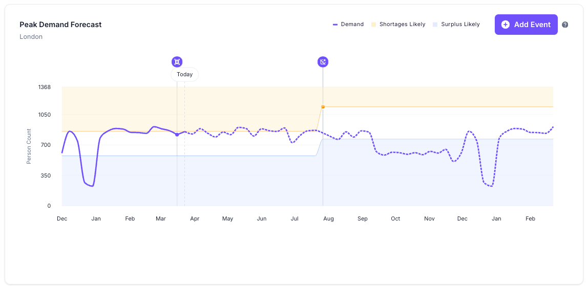
- Unseated % estimate in the Peak Demand Forecast tooltip: The Peak Demand Forecast tooltip now surfaces an estimated percentage of people who would be unseated at peak, not just raw numbers.
Occupancy Intelligence: Configure booking automations per space and space type
Booking automation settings are no longer one-size-fits-all. You can now set no-show grace, early-release grace, minimum and maximum booking duration, and passive-as-active behavior individually by space and by space type. Your existing settings carry over automatically as the company default, so nothing changes until you decide to fine-tune it.
What this means for you
Different spaces work differently, and now your automations can too. Give a focus room a shorter no-show grace than a large boardroom, or tune early-release rules for the spaces where reclaiming time matters most, all without affecting the rest of your portfolio.
Occupancy Intelligence: A clearer shortage view in the Space Usage timeline
The Space Usage timeline now shows the percentage of the selected time range that a space type was in shortage, rather than just flagging that a shortage happened somewhere in the range. The same clearer figure appears in the chart tooltip.
What this means for you
You get a truer read on how often a space type is actually running short, so you can tell the difference between a one-off busy hour and a persistent capacity problem worth acting on.
March 2026
Predictive Planning: UI Streamlined for Faster Decision-Making
Speed to decision matters. The faster you can move from understanding how your space will perform under real demand to knowing exactly what to change and where, the faster your team can act. In March, we reorganized the Predictive Planning experience to reflect how planning conversations actually unfold, allowing you to spend less time navigating and more time making decisions.
A Redesigned Experience:
Predictive Planning now follows a clearer three-step flow:
- Overview is your starting point and the primary output. Here, you can see whether this building is set up to support how people actually use it. Your forecast, key risks and trends, and where things stand today, all in one place.
- Risk Thresholds zooms into a single floor to show you the math behind your supply risk. Use the attendance slider to simulate any peak level in real time and watch the impact across each of the four normalized space categories.
- Recommendations turn all of the information contained in the Overview & Risk Thresholds pages into action. A summary at the top provides a high-level view of what changes support higher demand.
Instead of jumping between views to build a narrative, the platform walks you through one: here's what's happening, here's where the risk is, and here's what to do about it.
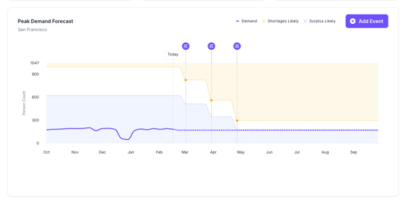
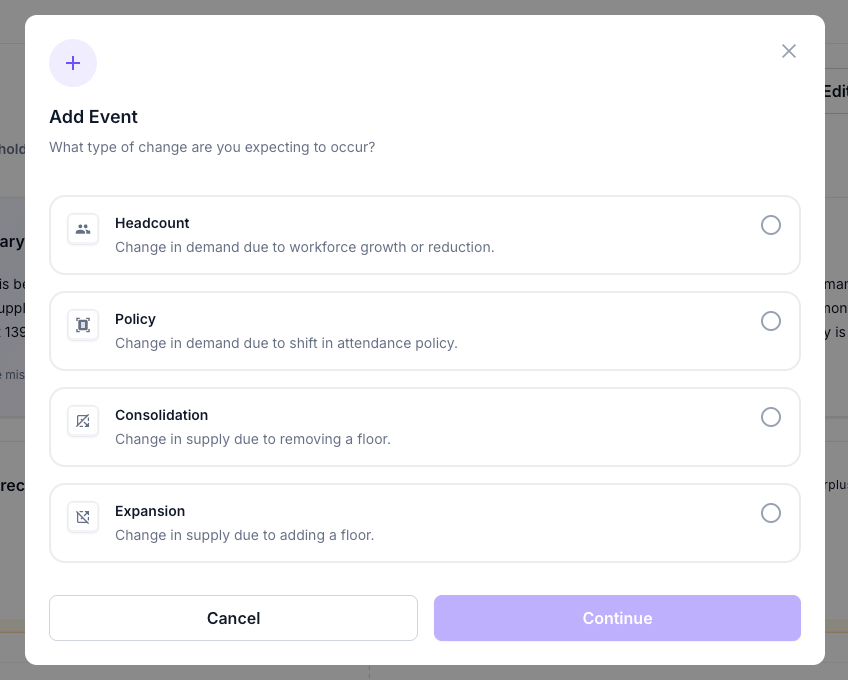
Model Two New Scenarios: Expansion and Consolidation
Planning doesn't stop at understanding current demand. Often, the most important question is: what changes if we change the space itself? Predictive Planning now allows you to model the impact of two new event types, directly in the platform:
- Expansion (Add a Floor): Explore what happens when you bring a new floor online, including impacts to your capacity thresholds and functional zone balance
- Consolidation (Remove a Floor): Model what happens when you take a floor offline. See how reducing supply affects your remaining floors' utilization, capacity balance, and employee experience risk.
Whether you're making the case to add space or proving you can give some back, these scenarios give you the numbers to back it up.
 |
 |
Occupancy Intelligence: Automating Your Operations with Connected Data
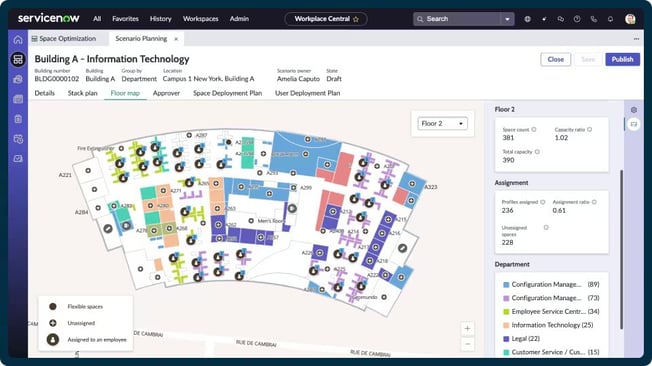
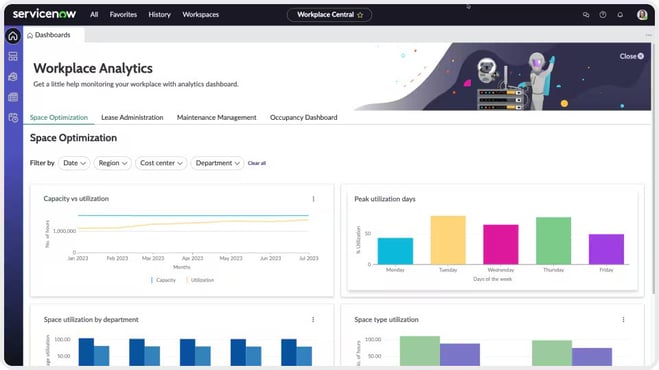
Having accurate occupancy data is the first step. Step two is making sure it reaches the tools and workflows where it drives action. That's why we're spotlighting one of our integrations this month with ServiceNow Workplace Service Delivery (WSD) that allows you to:
- Automate space management: Auto-create bookings when sensors detect occupancy, release no-shows, and free up unused rooms without manual check-ins.
- Get real-time utilization visibility: Push occupancy trends and meeting room metrics directly into ServiceNow dashboards, eliminating tool-switching and CSV exports.
-
Trigger cross-departmental workflows: Launch automated cleaning requests, maintenance alerts, and capacity notifications across facilities, IT, and HR based on real-time sensor data.
 |
 |
February 2026
Predictive Planning: From Insight to Defensible Action
February’s Predictive Planning updates enable you to:
- Build further confidence in the forecast
- Quantify employee experience tradeoffs
- Define realistic capacity boundaries
- Answer “what if” questions faster (without rebuilding the story in a deck)
Defensible forecasts, powered by updates to the Large Spatial Model (LSM)
.gif?width=1182&height=684&name=Untitled%20design%20(3).gif)
The upgraded Large Spatial Model now runs 1,000 Monte Carlo simulations to surface the highest-probability expected usage. Instead of a single-point estimate, you get a probabilistic view of how the space is most likely to perform. A single forecast number is rarely enough. Leaders want to know why it’s the likely outcome, and what the range of outcomes looks like if attendance shifts.
Why it matters: This changes the tone of the conversation from: “Here’s what we think will happen” to “Here’s what the model shows is most likely, and how confident we are.”
Measuring Employee Experience Risk Tradeoffs
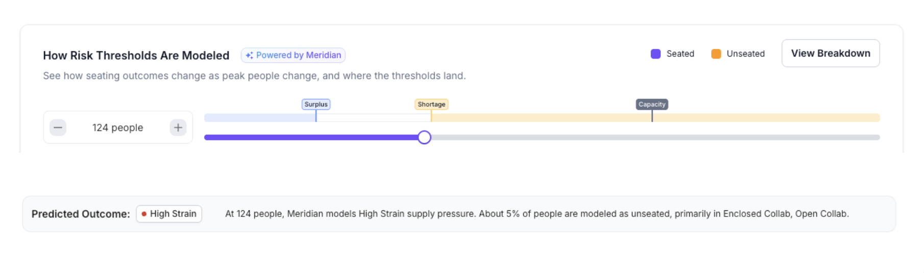
Employee Experience Risk is now a measurable output. The LSM can now quantify the percentage of employees likely unable to find their desired space type at any given attendance level and floor plan design.
With these updates, you can now:
- Model experience tradeoffs before policy or design changes
- Compare scenarios side by side using a consistent metric
- Align leadership on a clear risk threshold (instead of debating anecdotes)
When someone asks, “What happens if Tuesdays jump by 20%?” you can answer with specificity, not speculation.
Identifying the Optimal Operating Window with Capacity Boundaries
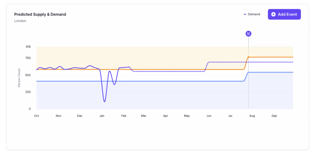
Meridian now defines capacity boundaries by identifying the optimal operating window for each floor, grounded in how people actually show up, not a theoretical maximum.
You get:
- A sustainable capacity range for each floor
- A clear view of when demand shifts push a floor into surplus or shortage
- A shared line in the sand for when a space is truly undersized or oversized
This update makes consolidation and growth decisions concrete. Instead of debating whether the latest numbers represent a blip or a trend, the platform draws the boundaries, so you can point to the operating window and say: we’re here, and here’s what needs to change.
Accelerate Your Planning Cycles
Even with a trusted forecast and clear risk metrics, teams still lose time translating insights into action: re-running scenarios, turning outputs into recommendations, and rewriting the narrative for executives.
We’ve released three updates to help speed up your decision-making processes:
- More actionable space design recommendations for design teams: “+1 conference room” instead of generic capacity outputs like “+15 seats.”
- Model new scenario event types: Model headcount growth, policy changes, attendance rates, and peak show-up.
-
AI-powered executive summaries: Every plan now comes with a personalized, contextual summary, including where you have surpluses or shortages.
Occupancy Intelligence: Measure with Clarity, Act with Confidence
The best planning strategy falls apart if you don’t trust the data behind it. These updates are about making sure the occupancy data flowing into your dashboards is complete, connected, and unambiguous, so you can act on it without second-guessing.
Native Integration Support for Juniper Mist WiFi Data

We know that for some buildings or projects across your portfolio, tapping into your existing WiFi infrastructure is the fastest way to capture occupancy trends at scale. That’s why VergeSense now supports a native Juniper Mist WiFi integration, managed directly within the platform. If your organization runs Juniper wireless infrastructure, you can ingest and analyze WiFi-based occupancy data alongside your existing sensor data, without separate setup or switching between tools.
With this integration, teams managing large portfolios can layer building-wide and neighborhood-level WiFi trends alongside granular space-level observations from area sensors. That combination gives you a more complete signal for decisions like consolidation, restacking, and targeted improvements—especially when you need scale and detail.
Clearer Labels for Floor Metrics vs. Space Metrics
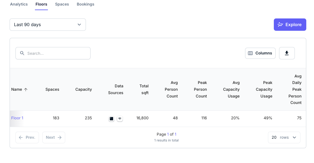
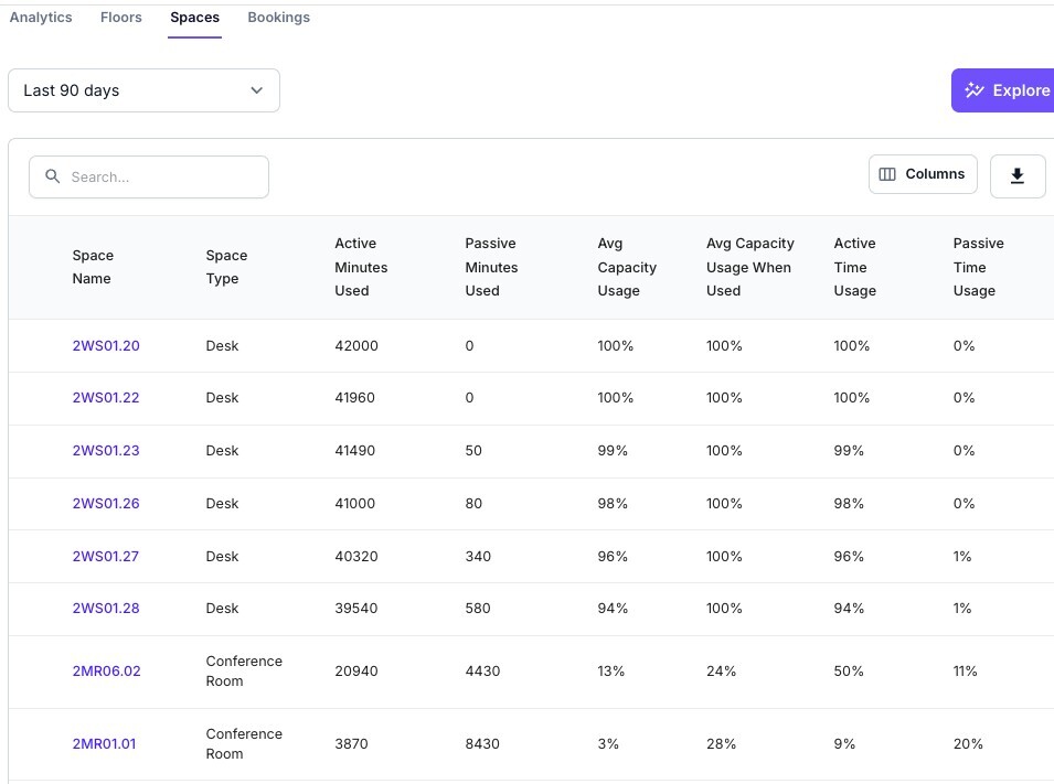
The question we kept hearing: “Which counts are floor-wide, and which are coming from individual spaces?”
We’ve reorganized and relabeled metrics across the platform so the source is clear at a glance:
- Floor metrics (WiFi, entryways) are grouped together
- Space metrics (area sensors) are organized separately
- New labeling makes it obvious what’s driving what you’re seeing
November 2025
New Metric: Time Usage by Person Count
Time Usage by Person Count gives workplace teams a clearer view of how spaces are being used by showing the percentage of time a space was occupied by 0, 1, 2, or more people. Instead of only knowing whether a room was “used,” this metric breaks down the actual occupancy patterns—helping you understand if spaces are consistently under- or over-utilized. This can be rolled up across space types (e.g., all conference rooms) or space groups (e.g., all rooms with smart whiteboards) at both the floor and building level to spot broader usage trends. To view a specific space's Time Usage by Person Count chart, click on the specific space within the floor plan.
View this data overtime to identify high (or low) usage days, or by specific day of week to understand typical usage.
September 2025
Occupancy Intelligence: Workplace Assistant, now built right into your dashboard
Workplace Assistant now lives directly inside the VergeSense platform. You can ask questions about your space data in plain language and get custom analyses and exports without leaving your dashboard or logging into a separate tool.
What this means for you
Your data analyst is right where you already work. Ask which floors ran over 80% Capacity Usage last month, or where no-shows are highest, and get an answer in seconds, in the same place you review the rest of your occupancy data.
August 2025
New WiFi Metric: Average Time on Floor - Average Time on Floor, Powered by WiFi Integration
The Average Time on Floor chart shows how long people are spending on a specific floor throughout the week. The data is grouped by days of week and broken into time ranges (e.g., 0–30 mins, 30–60 mins, 1–2 hours, etc.), giving you a clear view of how long individuals are typically present. When you hover over a specific day, you'll see the number of unique people detected and their average time on the floor.
Real estate and workplace teams can use this data to better understand space usage patterns. For example:
A high number of short visits (e.g., under 30 minutes) may suggest the floor is used mainly for quick meetings or touch-down work.
Longer times could signal the need for more focused workspaces, seating, or amenities.
This insight supports more informed decisions about space planning, cleaning schedules, and workplace experience strategies.
June 2025
Portfolio Interactive Map UI - each building is represented by a pin on the map, clicking said pin will open a ‘executive summary’ card for highlights about that building’s performance during searched time range.
Eptura Workplace Integration
We’re excited to launch our Eptura Workplace (formerly iOffice) integration for space metadata updates. Like the Serraview integration, the Eptura Workplace integration will pull in space updates (space name, capacities and space type), and alert VergeSense when spaces have been added or removed from linked floors. Eptura Workplace Integration.
April 2025
Passive Occupancy in Space Usage Timeline: See the impact of passive usage on availability in the Space Usage Timeline. Spaces with total time usage > 15 minutes [in an hour] will now contribute to shortage events!
Note: Not all devices have passive occupancy capabilities. Keep that in mind if the toggle does not appear for some Space Types.
Recently Run Reports: Looking for that Report you just ran, with the filters set just right? Easily view, re-run, or share your most recent Reports
Bonus: Share links are now significantly shorter
Booking Data Updates:
We’ve updated “No Action” bookings to be more specific - users will now be able to see Bookings that Ended Early and Bookings that were No Showed, but because no actions were enabled, the rooms were NOT released. In the Booking Summary Report, we’ve also added a table that shows the user how many spaces are mapped, and are adding whether an action took place to the Events Summary table. Learn more about Space Booking Integrations.
New Role - Site Lead: For customers looking for something more than analyst, but less than admin. Site Leads have access to Analytics and Reports for their assigned buildings, can create new space types and groups, and can access the Device Manager. However, they cannot add new team members or access integrations, API keys, or the Installer Tool. Review all User Roles & Permissions here.
February 2025
Export Updates
- Download a CSV or PNG of graphs and maps in platform
- In Settings --> Export Data, you can now export one or many buildings or floors with ease!
January 2025
- New Metric Release: Average Daily Peak [Person Count]
- New Building Insight: Person Count Trends
Average daily peak gives you a better understanding of “typical peaks” in your buildings, softening outliers and allowing for a more complete picture of how spaces are being used. Average Daily Peak is useful for occupancy planning and design, ensuring spaces can accommodate both averages and usual peaks.
Average [of the] daily peak[s] is calculated by taking the Peak of each day in the time period and dividing by the total number of days in the time period. In a five day week with peaks of 10, 12, 15, 13, and 5, for example, the Average Daily Peak is 11.
View Average Daily Peak in the person count timeline (above), data tables in portfolio (select the Buildings, Floors, or Spaces tab), and in our new Person Count Trends Building Insight!
Person Count Trends for the Building compares the most recent month to the month prior, and any meaningful changes in Average Daily Peak.
Learn more about Building Insights in Building Insights.
Updated
Comments
0 comments
Please sign in to leave a comment.